PRODUCT DESIGN CASE STUDY
Picture this: a user-friendly app packed with excellent products, but customers can't navigate through it to make purchases. Well, that's the misery our users face with the Daily Objects app.
It's like having a treasure trove hidden behind a labyrinth!
Despite offering top-notch products, people end up buying them from different retail stores instead. We need to put an end to this frustrating journey and ensure a delightful shopping experience within the app.
A Scrollmation section includes one column for text and one for a sequence of images (on narrow screens, the top portion of the screen will show the image sequence while the text scrolls beneath).
With multiple image frames and slight changes between them, it is relatively easy to add some animation to your explanation. Changes could include highlights, dates, size increases or more.

Detective mode on 🕵️
During our secondary research phase, we kick-started our investigation with a series of questions to guide our exploration:
- What is DailyObjects about ? What's the purpose ?
DailyObjects is an online and mobile marketplace for designer, personal, and tech accessories in India. The company was founded in 2012 with the aim of making everyday carry "less ordinary" by offering a carefully-curated selection of high-quality, stylish products. Daily Objects aspires to give its customers an avenue of personal expression, through its products that help customers to make a unique statement about who they are. - Who are the primary customers of Daily Objects?
DailyObjects's target users are young people and new-age professionals (ages 25–34) who want unique design accessories intrested in fashion, technology and travel. - What is the product range of DailyObjects and what is the highest selling product ?
DailyObjects offers a wide range of tech, bags, wallets, and home office accessories.Thier highest selling product is phone-cases. - Why is it crucial for us to address this problem?
People, in general, are satisfied with the quality of products DailyObjects offers but not with the experience the app provides. Most customers of this brand choose to order from other e-commerce stores like Flipkart, Nykaa, and Amazon. - How can we better understand user behavior patterns?
We can look at the user rewies on the google play store , conduct user interviews and youtube comments .
THE PROBLEM STATEMENT FLOW


ACTION BLUEPRINT
To make things smoother and meet our deadlines, we devised a master plan that harnessed the unique skills of each Avenger. This way, we could tackle all the necessary processes in parallel and keep the project on track. However we could not stick to the plan.
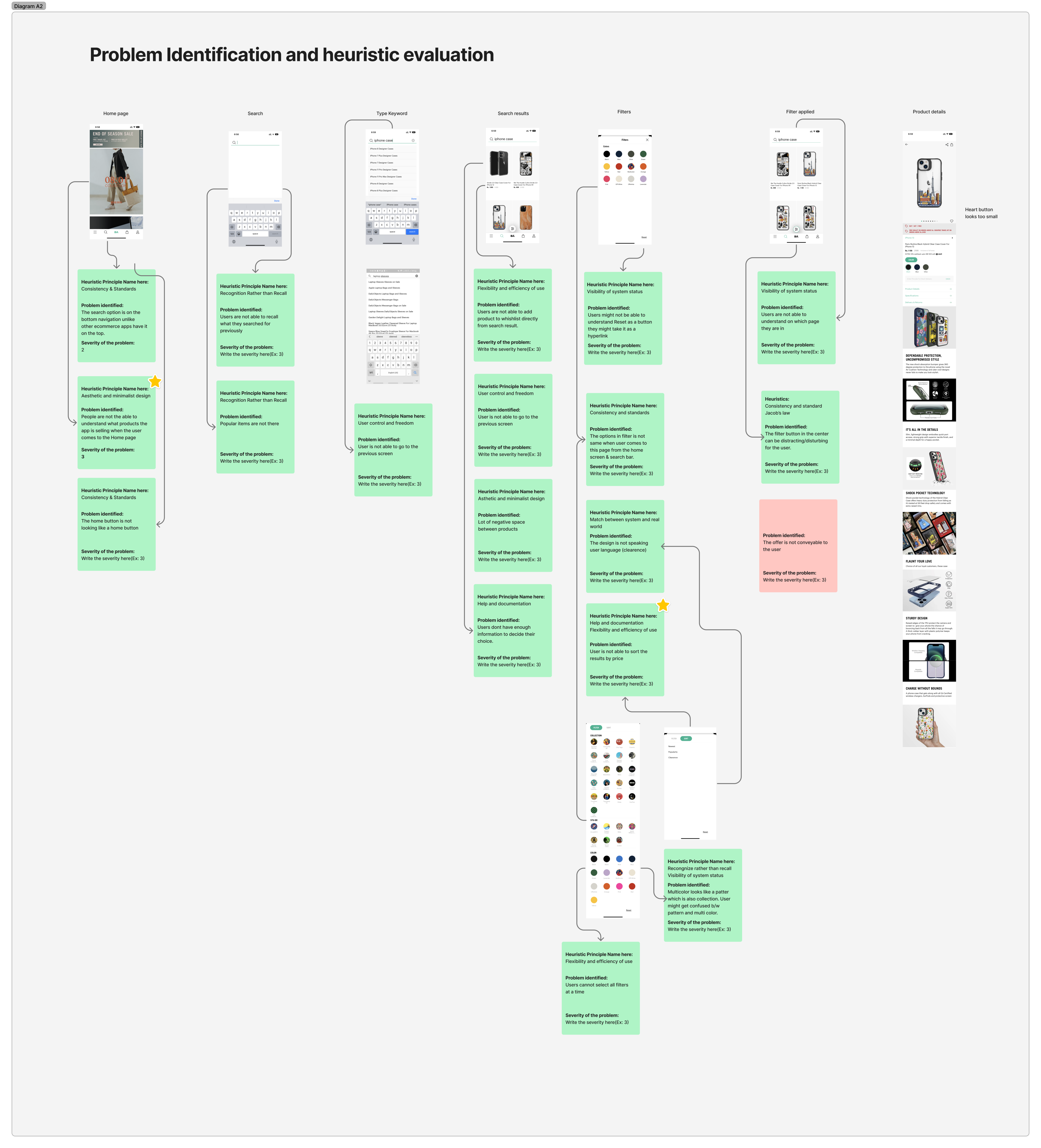
Some of the problems we found from Heuristic Evaluation:
After a
HERE IS MY SOLUTION
IDEA SPROUT
Building hypothesis
Then we sat down to brainstorm solutions . It was a super fun session with every teammate pitching in their ideas , guesses and backing them up with reasons.

HYPOTHESIS SCREEN 1
🔸I think the search bar should be on top for better discoverability.
🔸The hero image occupies a large part of the screen, it should be given less real estate.
🔸There are no categories shown leading to some ambiguity regarding what the app sells.
🔸The text can be structured in a better way which prompts the user to make purchases.

HYPOTHESIS SCREEN 2
🔸There should be a back button for better navigation so that the user does not feel stuck.
🔸Help the user recall their search history or last orders.
🔸I feel the user might feel stuck and would want an option to access the home button.
HYPOTHESIS SCREEN 3
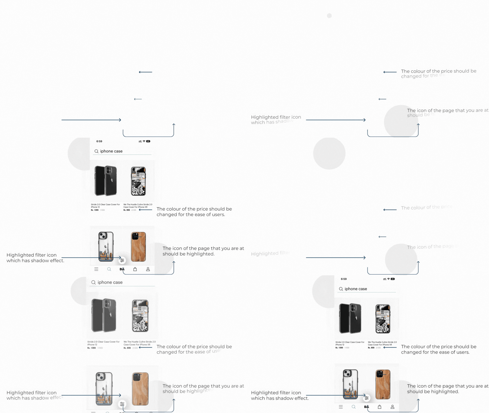
🔸The color for MRP can be different which helps the user to reduce cognitive load and provides a clear distinction for the relevant information.
🔸The selected icon in the nav bar should be more prominent , it might be confusing for users right now.
🔸I feel the user might feel stuck and would want an option to access the home button.
DESK RESEARCH
This was the part I loved the most, digging deep into the product and and its different aspects. We opted for different channels to take our research pointers from different mediums. This also understand our topic better and validate our hypothesis.
🔸 Daily objects drives its main traffic from Youtube channels. So we looked across all the Youtube channels to find out about the reviews.
🔸Searched across different articles to understand about the product.
🔸Browsed through google play store reviews.
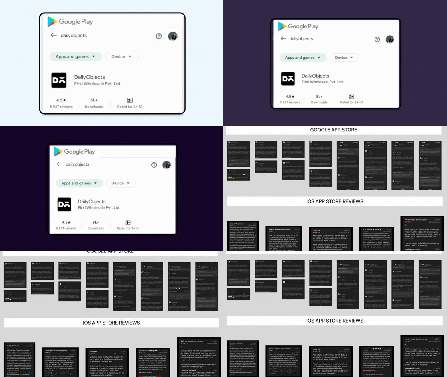
🔸Technical bugs, such as the app closing repeatedly.
🔸The inability to see wishlisted items.
🔸A complicated return procedure.
🔸Difficulty finding products.
🔸A bad customer experience.
COMPETITIVE ANALYSIS
We made sure to
Taking our questions forward and working in the reverse order ensured that our research stays interesting and relevant.


Extracting Valuable Feedback from YouTube Comments
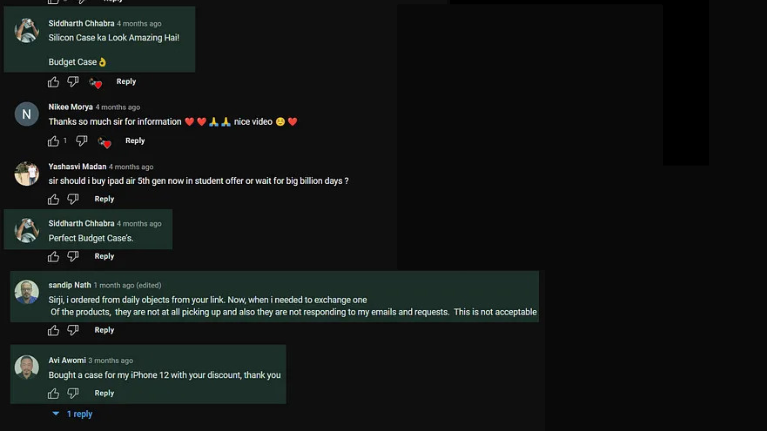
I analyzed a YouTube video that reviewed Daily Objects' cases, which were the primary focus of the review. The comments revealed a significant number of individuals making purchasing decisions based on that review.
PRIMARY RESEARCH

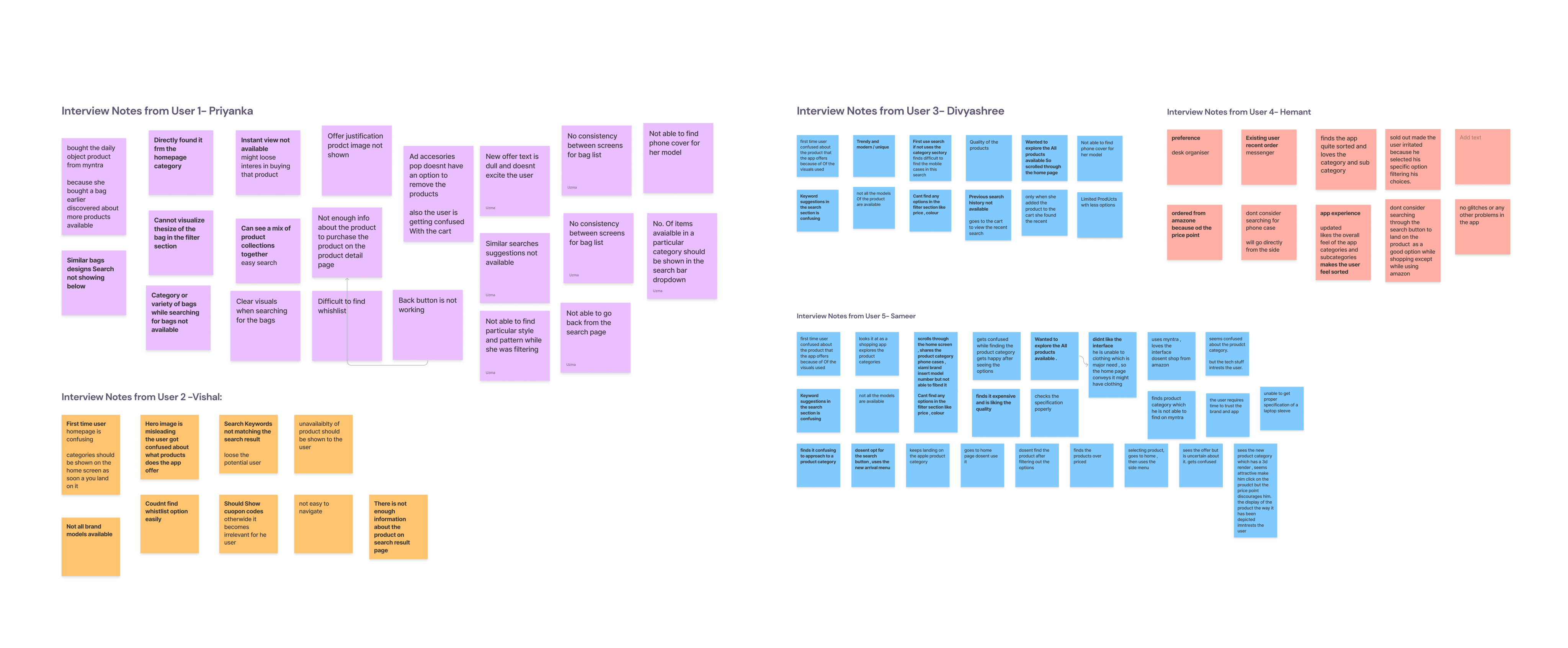
We got chatty with our app users to uncover the deets! Chatting up real people gave us epic insights and helped us dive deep into any bumpy bits. Stats showed most users rocking' the ages 18 to 35, so we high-fived that group for our interviews - keeping it real, you know?Oh, and turns out, boys were ruling the user base kingdom! So, we had a blast interviewing more bros to get their takes.Mixing up the user interviews with our research, we cracked the code to improve the Daily Objects App experience. A win-win for everyone!

VALIDATING HYPOTHESIS
We validated our hypotheses by conducting user interviews and voting on the most impactful ones. We were thrilled to find that all of our hypotheses were validated, and the user interviews gave us valuable insights for our next steps.
Here are some specific things we learned:

- Users were confused by the hero image on the Home page. We're going to reduce the size of the hero image and add more space for other items.
- Users wanted to be able to quickly retrieve recently searched items. We're going to add search history alongside product images.
- Users wanted more filter options. We're going to add additional filter options, such as colors and price ranges.
- Users wanted more information about products, such as ratings and reviews. We're going to add features like Save to Wish List and User Ratings.
We're grateful to the users who participated in our interviews, and we're excited to use their feedback to improve our app.
IDEATION

So, during the ideation phase, we put our thinking caps on to tackle the problems that our users raised during research. We had some fun group sessions where we listed the key issues and got to brainstorming some awesome ideas!

Sketch-mapping
After doing all our research , we came to the fun part , each of my team members divided screens and we proceeded with low fidelity and high fidelity wireframing.

Progressing further, we developed high-fidelity wireframes to gain a clearer and more detailed vision of the screens we intended to create


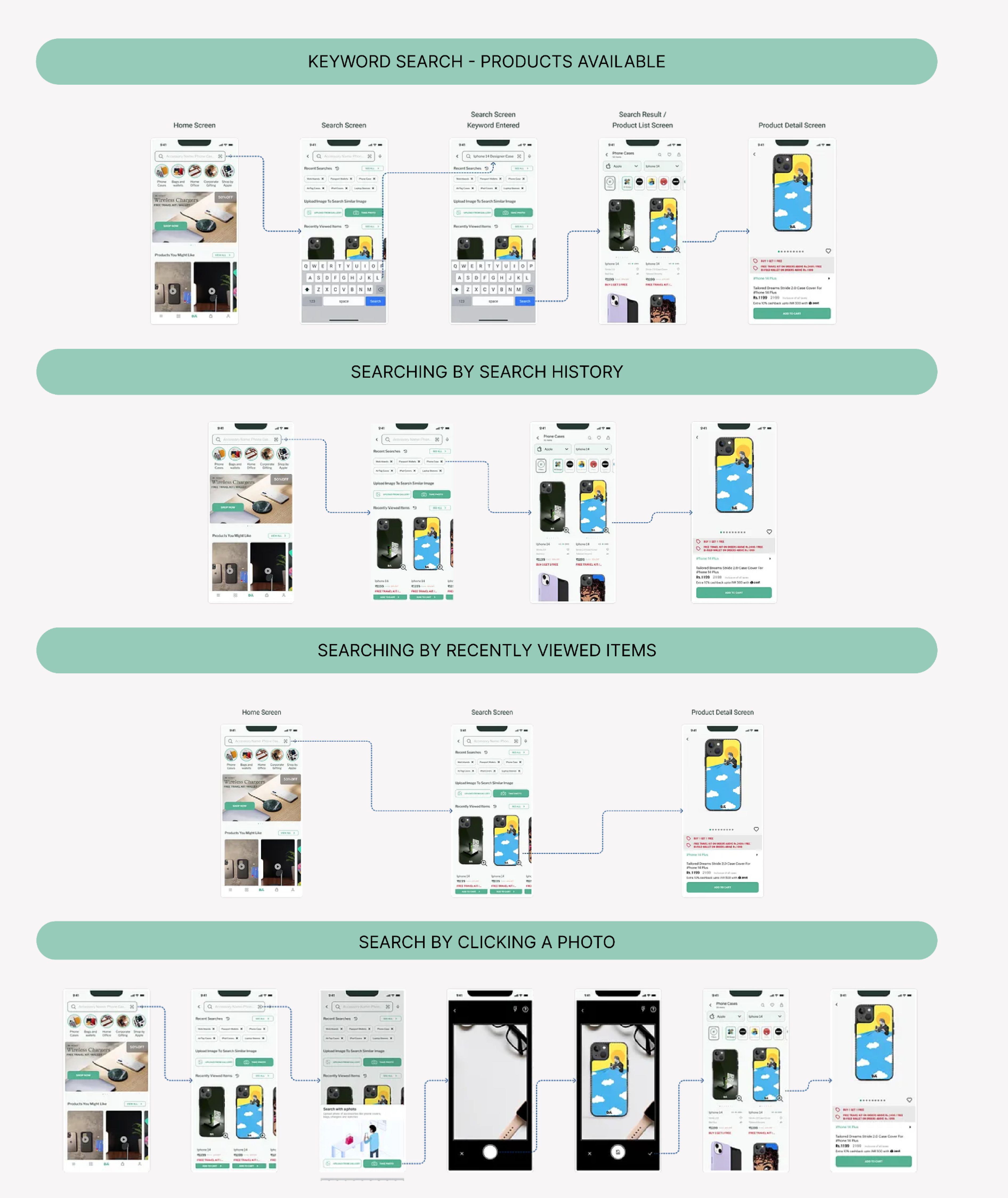
SEARCH USE CASES
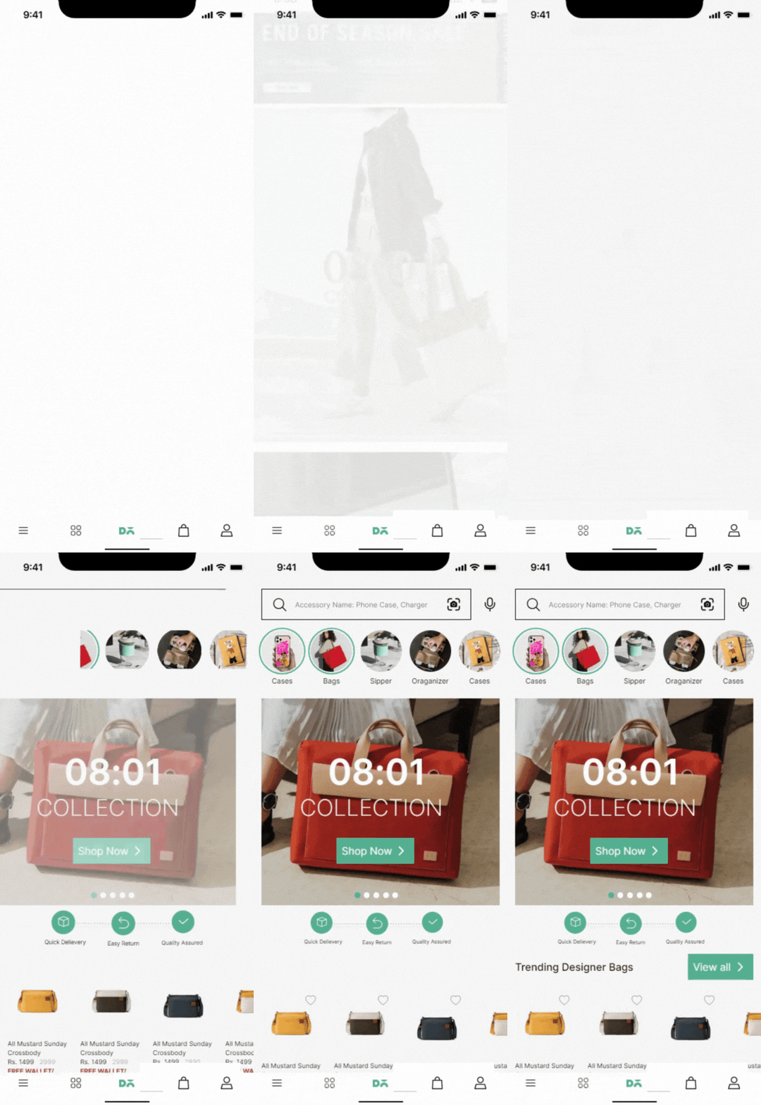
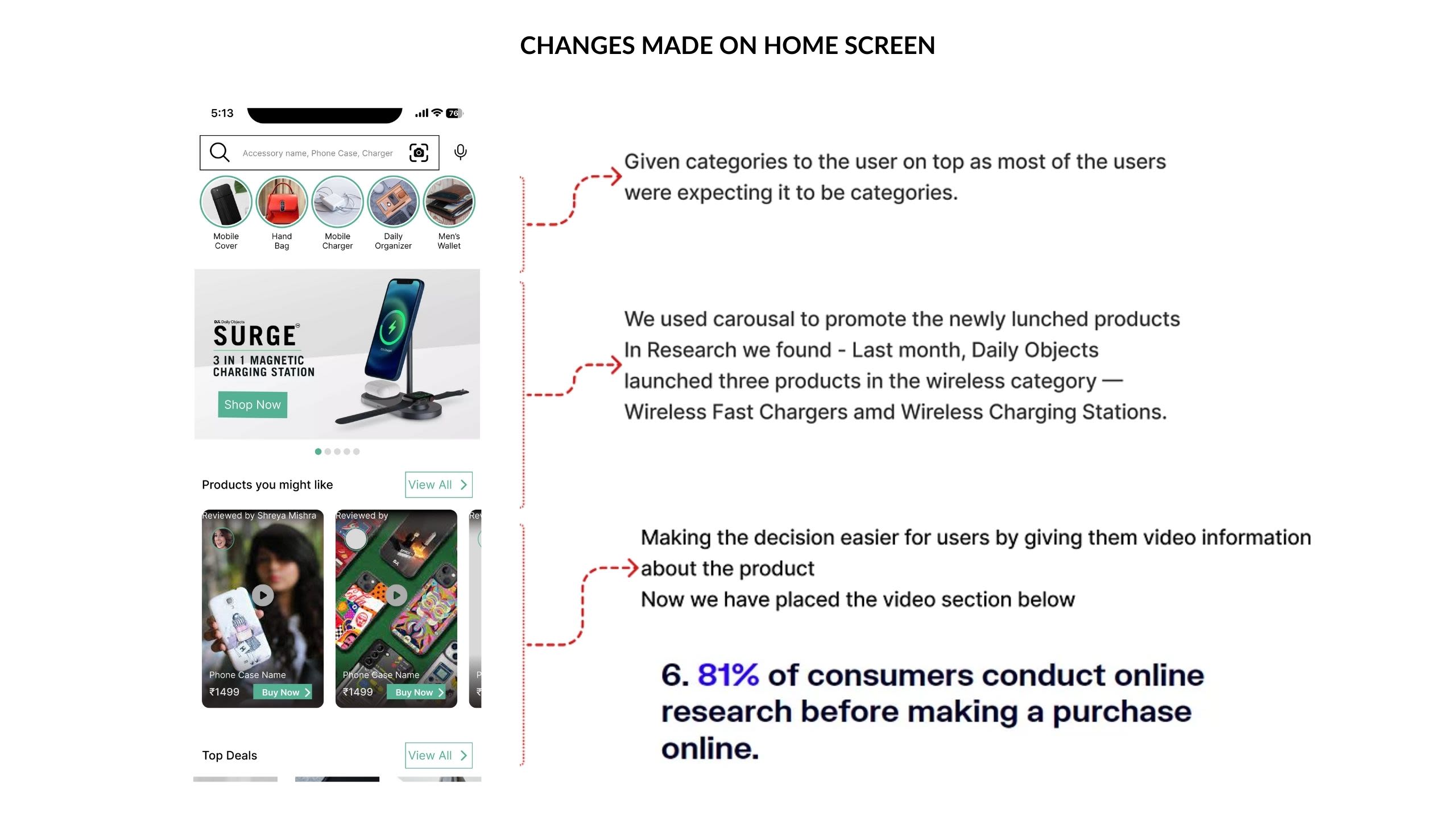
Challenge: We had two screens that needed a UX makeover, and boy, did we make some awesome changes!

- Search Bar : We moved the search bar to the top, making it super easy for users to find what they need. Categories stepped up to the plate, guiding users like a pro and saving them decision-making time.
- Hero Image Slim-Down: We trimmed the hero image to make room for exciting additions. Now the screen is poppin' with more cool stuff!
- Stories : Inspired by Insta, we unleashed the Stories feature below the search bar. Get ready for some interactive fun!
- Category Power: We used smart design tricks to show off categories. Users can now explore like champs without feeling overwhelmed. Easy peasy!
- Rocking CTAs: We dropped two CTAs in well researched spots for speedy actions.
- Trust-Boosting Icons: Reassurance icons in a linear format , making users feel safe .
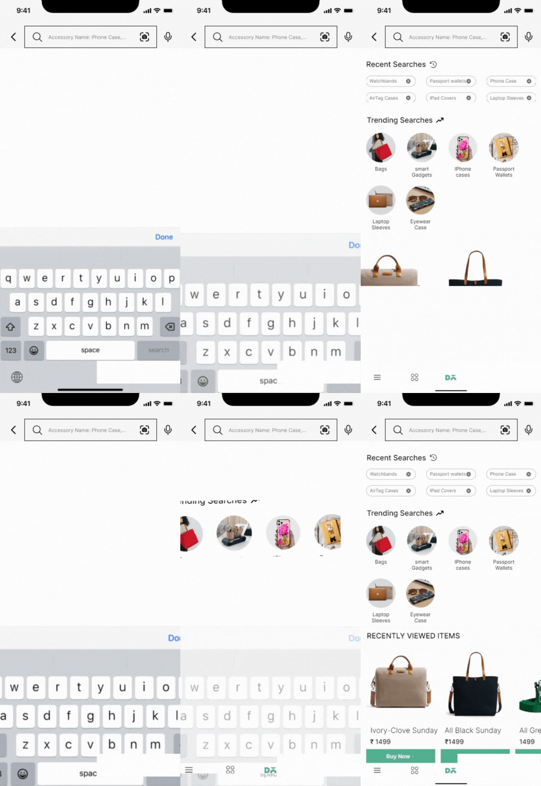
Recent Search Suggestions: Now, when you search, you'll get helpful recent suggestions right below the search bar.
Trending Searches: We added some spice to the app with trending search suggestions. Stay engaged and discover what's hot!

Recently Viewed Items: Never forget a thing! Your recently viewed items are now at your fingertips, reminding you of your browsing history
Back Button: Getting around is easy and accessible with the shiny new back button for smooth navigation.
IMAGE SEARCH
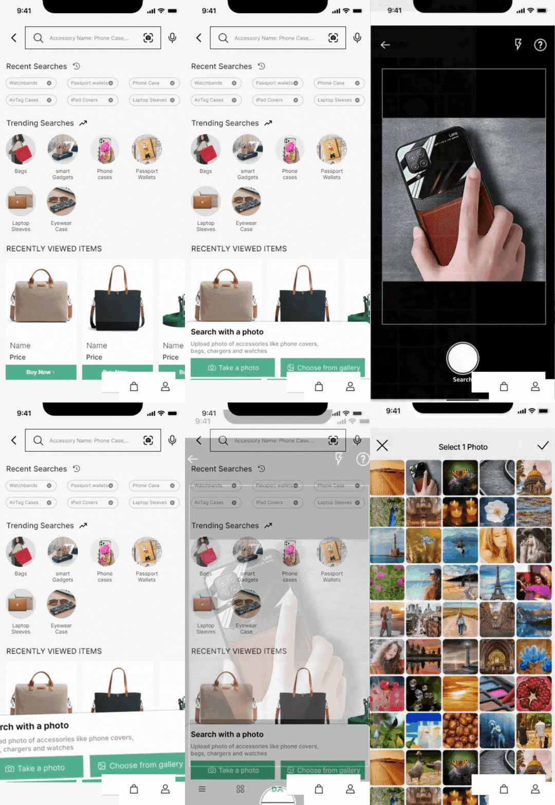
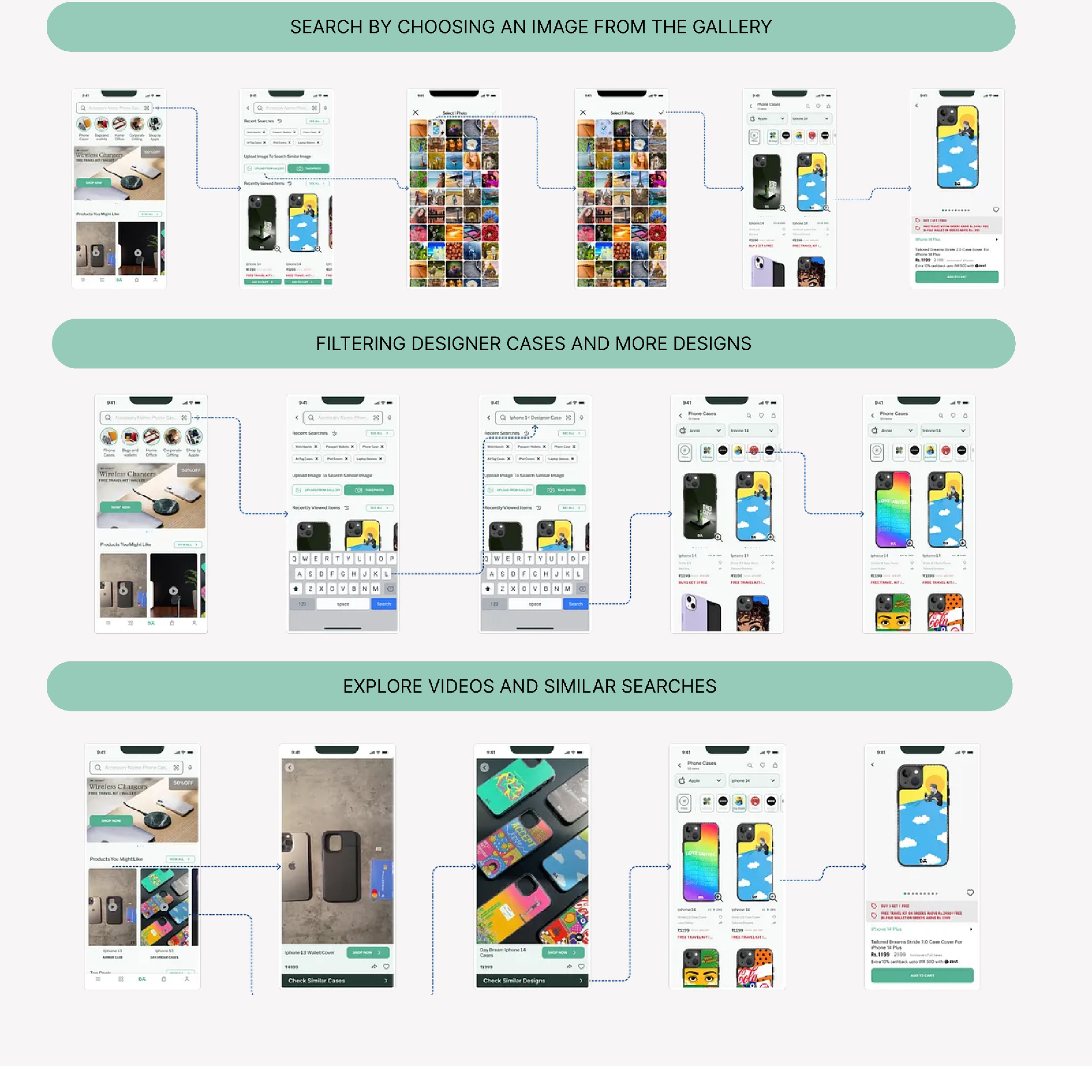
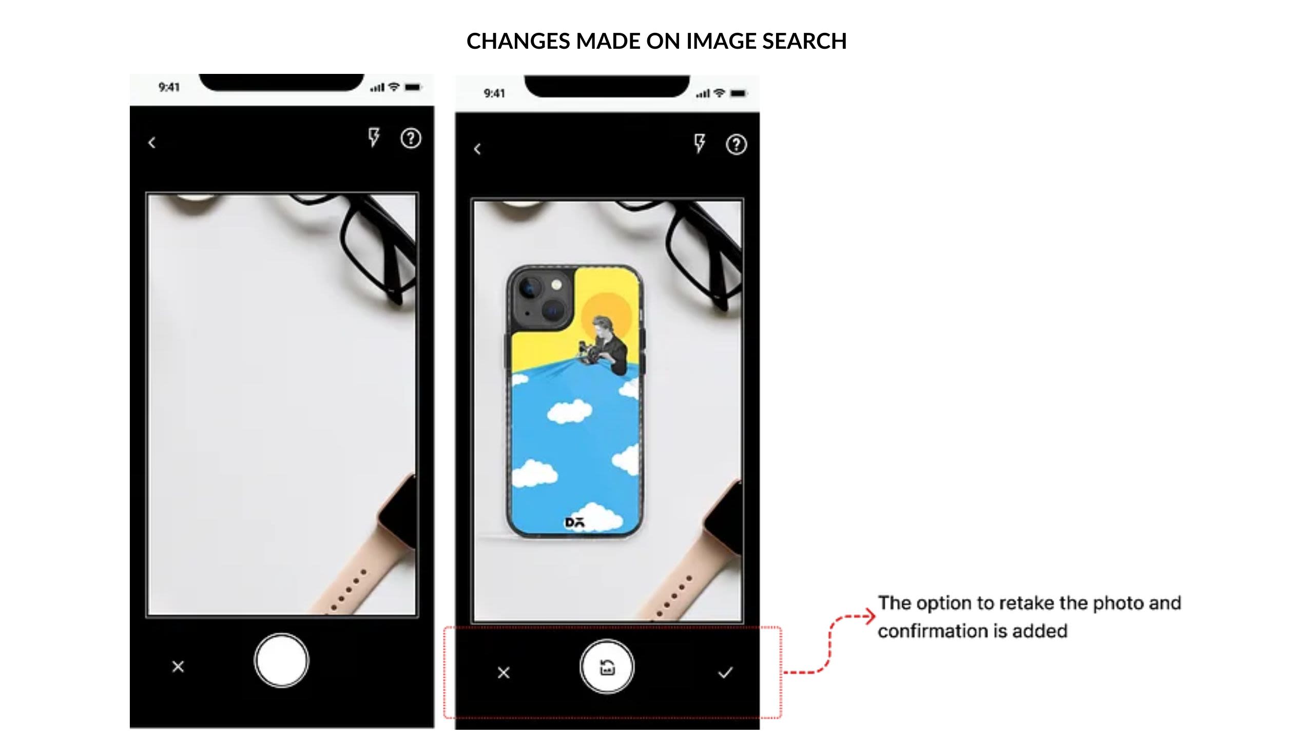
We've spiced up the search options with two cool features inspired by Amazon & Myntra. Now, users can "Take a Photo" or "Choose from Gallery" to find what they want fast.
PRODUCT LISTING PAGE
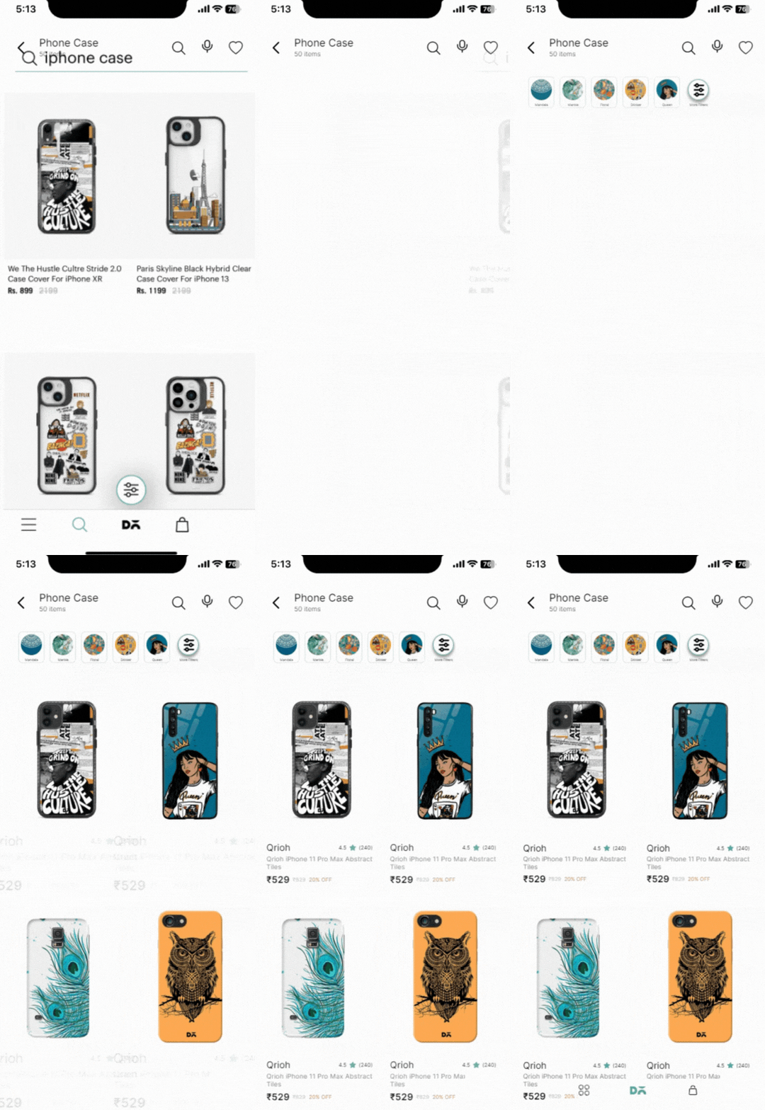
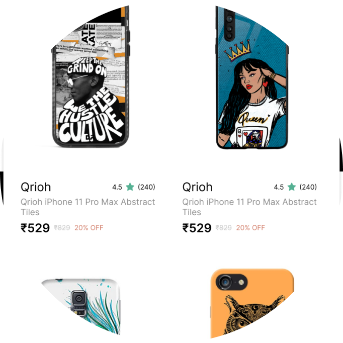
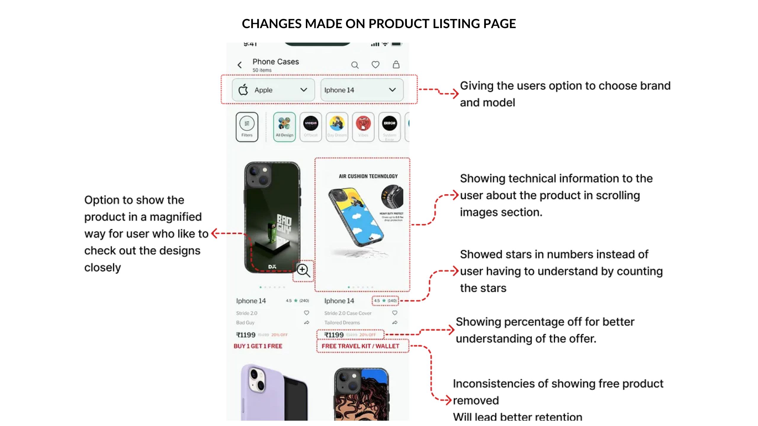
Building an enhanced customer experience! Now, you can see user ratings and the number of ratings right alongside the products.
Easy decision-making with more details at your fingertips! By moving the filter option to the top, it's now super visible, saving you time and effort.
Plus, we've added "Add to Wishlist" and "Share" buttons, so no more extra clicks to view product details. It's all about convenience and enjoyment!
OPTIMIZING FILTER OPTIONS

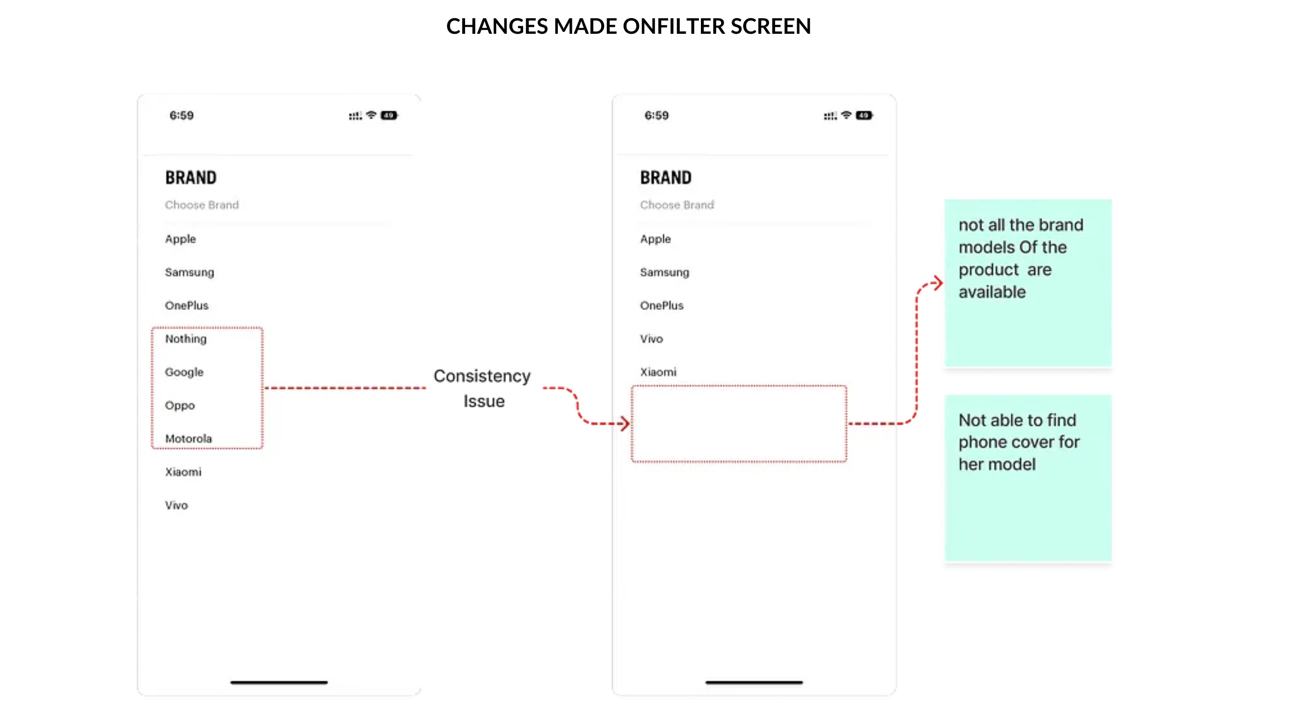
More filter options like filter by price, availability, category and colour are added for better search experience.
j4
DIFFERENT USE CASES
We made sure to keep different use cases in mind while improving the search and filter flow.
INTERFACE BEFORE USABILITY TESTING
INTERFACE AFTER USABILITY TESTING

🔸GET SET GO ! Once we were ready with our designs, it was time to test them with our users. We wanted to get their feedback on the usability of our designs, and see if they were able to complete the tasks that we had set for them.
🔸WITH WHOM ? We recruited 5 users to test our designs. We reached out to them through Discord, physically, and through our friends and family. We wanted to get a diverse group of users, so we made sure to include people of different ages, genders, and levels of experience.
🔸HOW ? We conducted the usability tests remotely. We created a tappable prototype of our designs, and we asked users to go through the flow and think out loud while they were doing the task. How users were interacting with the new changes, and if they encountered any problems while using them.
Conducting Task-Based Usability Test and Understanding User Perception
🔸We aimed to gain valuable insights into users' understanding of each screen by incorporating a well-crafted questionnaire. Here's an overview of our approach:
1. Task-Based Usability Test: We designed a series of tasks to evaluate the users' interaction with the app. These tasks were tailored to simulate real-life scenarios and test the app's usability under practical conditions.
2. Questionnaire on User Perception: To understand users' perceptions, we asked targeted questions related to various sections of the app. Our questionnaire included the following prompts:
🔸 Home Screen:
- Tell us about your understanding of the home screen.
- Describe your understanding of the first section of the home screen.
🔸Search Screen:
- Share your understanding of the search screen.
🔸 Product Discovery Scenario:
- Imagine you are at a party, and you liked your friend's phone case. How would you search for a similar one in the app?
🔸 Purchase Scenario:
- While browsing, you found a captivating phone case that you want to buy. Describe how you would proceed with the purchase.
🔸Design Selection Task:
- Go ahead and search for a phone case, then choose a design that you like.
🔸 Finding Cheaper Alternatives:
- If you found items expensive and desired more affordable options, explain how you would go about finding cheaper alternatives.
🔸 Understanding Filters:
- Tell us about your understanding of the filters and how you would use them.
By combining task-based testing and user perception assessment, we gained valuable user feedback and insights. These findings served as the foundation for enhancing the app's user experience and ensuring a user-centric design approach.
LEARNINGS FROM THR PROJECT
Participating in my first Designathon has been an invaluable experience, offering essential insights
- Teamwork Triumphs: I learned the significance of effective teamwork, which will undoubtedly enhance my future performance.
- Embracing Imperfections: Perfectionism can impede progress; I realized the importance of balancing perfection with timely execution.
- Beyond Tools & Skills: Being a designer requires more than just technical expertise; it involves a broader understanding of design principles and problem-solving.
- Time Management: As the time keeper, I recognized the importance of adhering to deadlines and keeping the team focused on moving forward.
- Speaking Experience: Taking the lead in presenting our progress on day-1 provided me with valuable public speaking experience, which I found rewarding.
FUTURE SCOPE
Streamlined Search: We are delighted to present a personalized search section on our home page, akin to Amazon's functionality, allowing you to seamlessly continue your previous search and find exactly what you need.
🔸Personalized Search: Find what you need effortlessly with our Amazon-like personalized search section.
🔸Comparison-Based Systems: Make informed choices by comparing products quickly and easily.
🔸Enhanced Wishlist: Compare multiple products on your Wishlist for seamless decision-making.
🔸Referral Rewards: Share and save! Refer our products to friends and earn discounts together.
🔸Community Showcase: Show off your creations and see the best designs featured on our home page.
🔸Social Media Promotions: Share your Daily Objects experience on social media for exclusive discounts and trust-building features.
