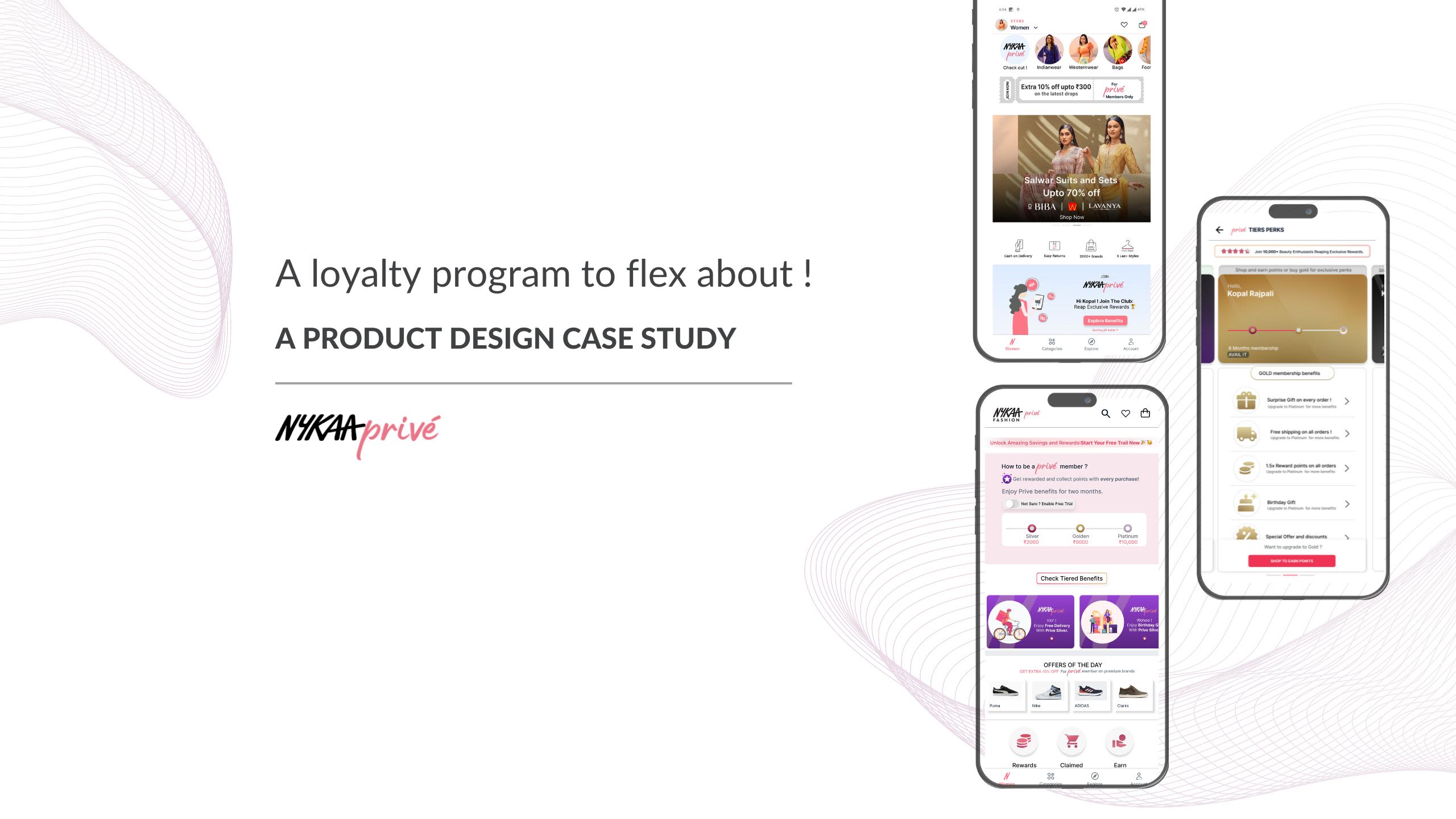

My Problem Statement
Design a loyalty program which incentivizes users to make more purchases by offering rewards and exclusive benefits
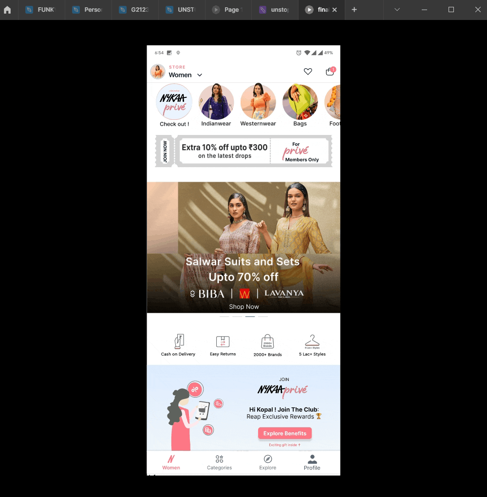
Let's dive into the feature I crafted ⬇️. To make things more enjoyable, just for storytelling purposes, I have depicted my feature as a character - Prive Pixie.
Let's look at the design process
You might want to interact with the prototype! 👇😊

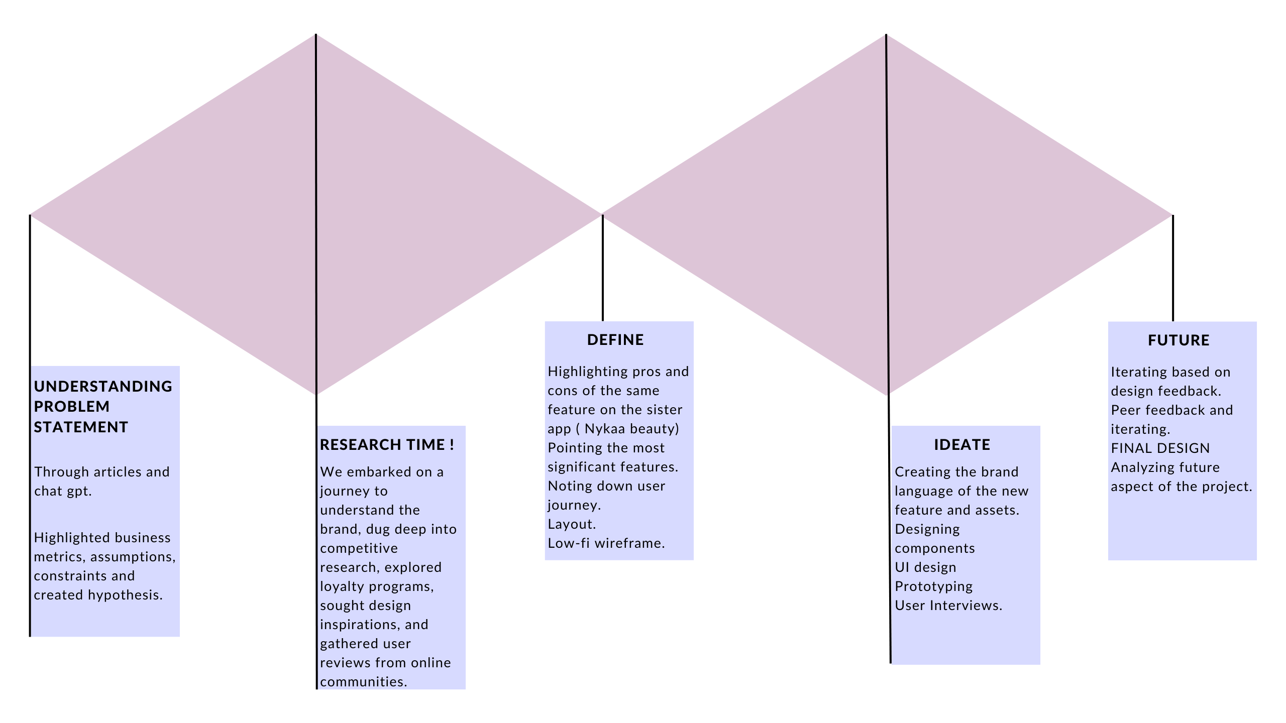
I followed 💎💎Double diamond process w ith progressive convergence and divergence to discover, research , ideate design deliver. To achieve these goals, I followed a user-centered design process that involved research, ideation, prototyping, and testing.


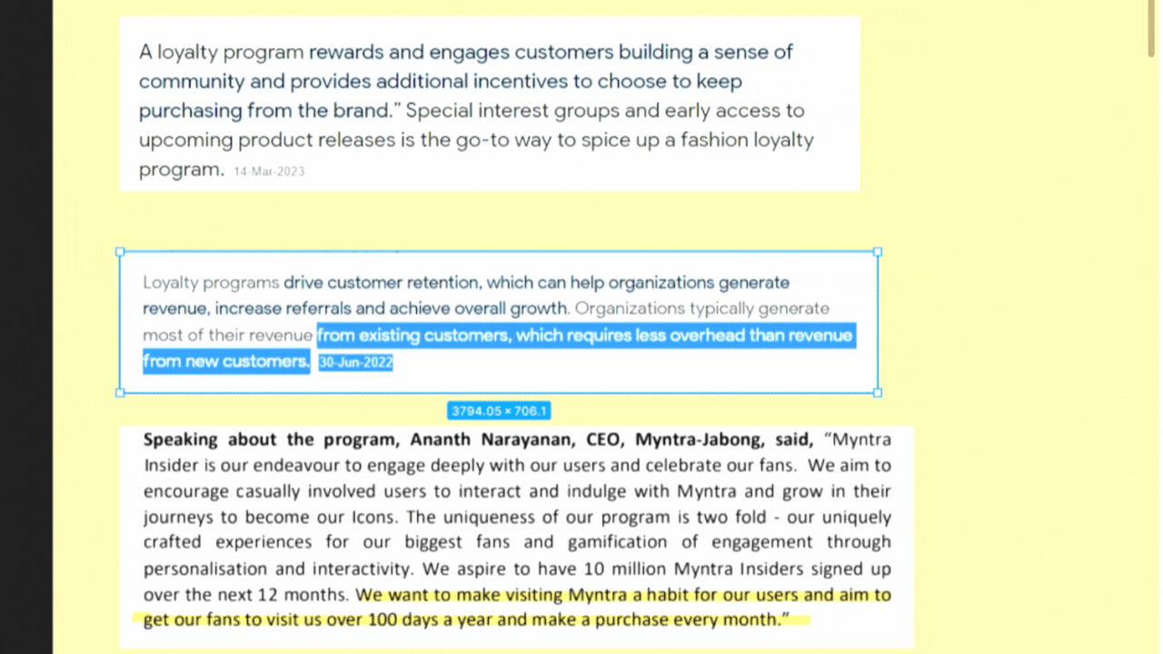
As a UX designer, I love creating solutions that balance business goals and user needs. That’s why I was thrilled to design a loyalty program for Nykaa Fashion, the sister brand of Nykaa Beauty. Nykaa Beauty had recently launched their multi-tiered loyalty program, Nykaa Privé, which offered exclusive perks and rewards to their shoppers. I wanted to create a similar program for Nykaa Fashion, but with a twist that suited their unique brand identity and audience. Let me walk you through the process of how I did it.
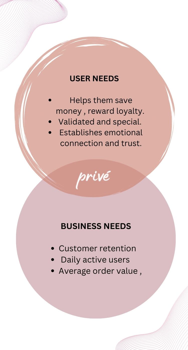
- The loyalty program I designed for Nykaa Fashion had two main objectives
- to make the user feel valued and to increase the business metrics. I wanted the user to feel a sense of belonging, trust, and satisfaction when they shopped at Nykaa Fashion. I also wanted them to save money and get rewarded for their loyalty.
- On the other hand, I wanted the business to benefit from higher customer retention, daily active users, and average order value.
Design without constraints? It's like a slow stroll in the park - less adrenaline, more yawn!”
Let's list down some constraints.
The design should prioritize ease of use and intuitiveness.
The design funnel should be kept short as it supports the primary function of the app, rather than being the main focus.
Scalability should be a key consideration in designing the loyalty program, accommodating a large user base and numerous transactions.
The design language of Nykaa Fashion should be taken into account, ensuring consistency and coherence.
Creating a bridge between Nykaa Fashion and other sister brands like Nykaa Beauty and Nykaa Men is crucial.
Careful consideration should be given to the cost of providing rewards and exclusive benefits to users, ensuring it aligns with the expected return on investment.


Desk research 🔍
What are we looking for ?
Before designing the loyalty program for Nykaa Fashion, I wanted to understand the context and the users better. I conducted secondary research to answer the following questions:

- What are the different types of loyalty programs and how have they evolved over time in the e-commerce industry?
- Who are the typical users of Nykaa Fashion and what are their demographics, preferences, and pain points?
- What are the types of benefits that attract users to shop online and join loyalty programs?
- How are the tiers distributed in the loyalty programs and what are the best practices to design them?
- What are the motivations of the users behind availing loyalty programs across various channels such as online apps, physical stores, and credit cards? What are the differences between Nykaa Beauty and Nykaa Fashion in terms of their brand identity, product offerings, and target audience?
- How does color psychology influence the visual language of design and what feelings do they evoke in the users?
- What are the latest trends and developments in Nykaa and its competitors?
- I also wanted to know why Nykaa Beauty launched Nykaa Privé and how they conceptualized it. I looked at their website, app, and social media to learn more about their loyalty program and its features, benefits, and feedback. I also compared it with other loyalty programs in the beauty industry to identify the gaps and opportunities for improvement.
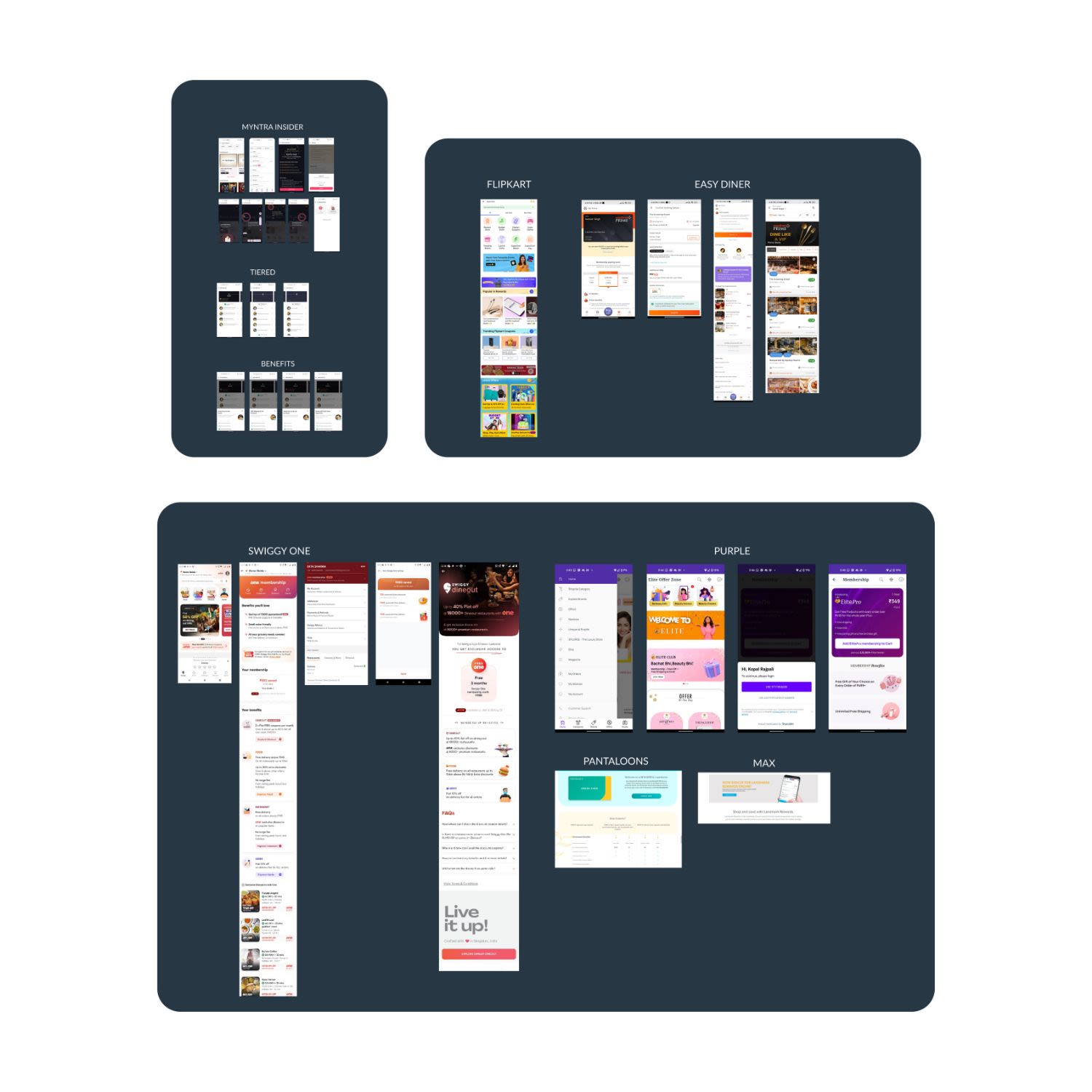
Competitor analysis
Competitor Analysis: The Express Lane to UX Solutions

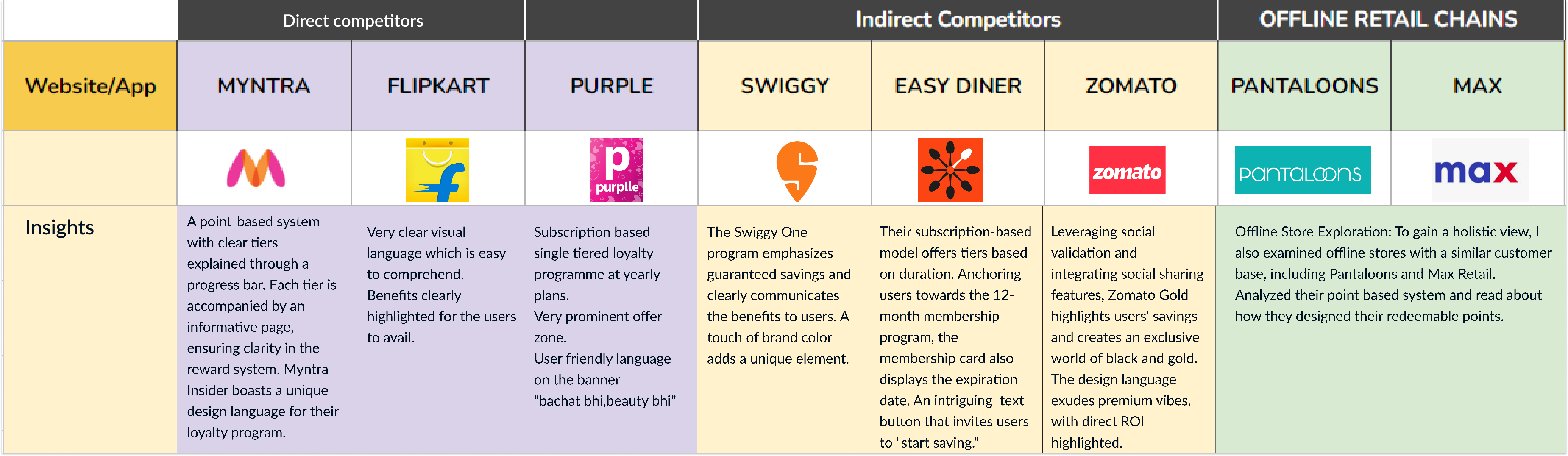
I started to explore loyalty programs and gain valuable UX insights.
- Direct Competitors: I zoomed in on the top players, including Myntra, Ajio, Amazon Fashion, and Flipkart Fashion. Exploring their loyalty programs, I discovered user flow, visual language, and a diverse range of program types.
- Indirect Competitors with Loyalty Programs: Shifting gears, I explored indirect competitors like Swiggy, Zomato, and Easy Diner.
- Offline Stores Exploration: With a lot of nostalgia hitting, I ventured into the realm of offline stores with a similar customer base. Pantaloons and Max Retail provided insights into loyalty programs from a physical retail perspective.

Key takeaways
- 🆓 Free Trial Awareness: Create awareness about the free trial to attract users and introduce them to the benefits of the product.
- ⬇️ Bottom CTA Placement: Place the call-to-action (CTA) at the bottom of the page to align with Fitts' Law, making it easier for users to locate and interact with the button.
- 💰 Highlight direct ROI: Emphasize the direct return on investment (ROI) for users, showcasing how the product or service will benefit them and meet their needs.
- 🌟 Include social proof.
- 😞 Address user pain points.
- 😊 Keep the language friendly.
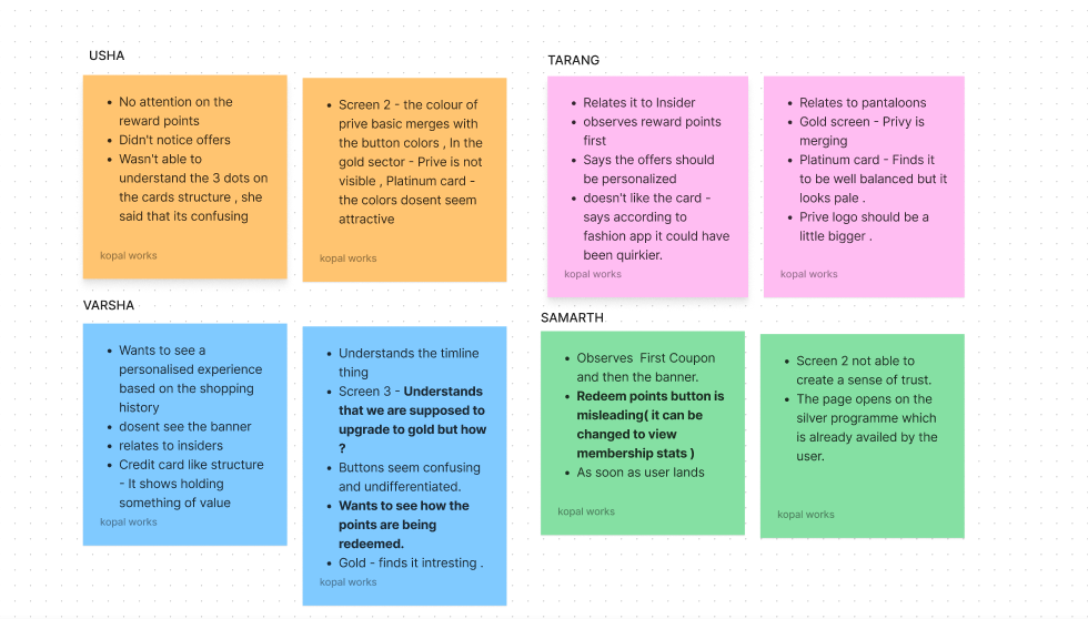
Unveiling User Pain Points: Insights from Online Sources
User Reviews: Examined feedback from the Nykaa app, social media, and e-commerce websites. These reviews highlighted specific frustrations and pain points shared by users.
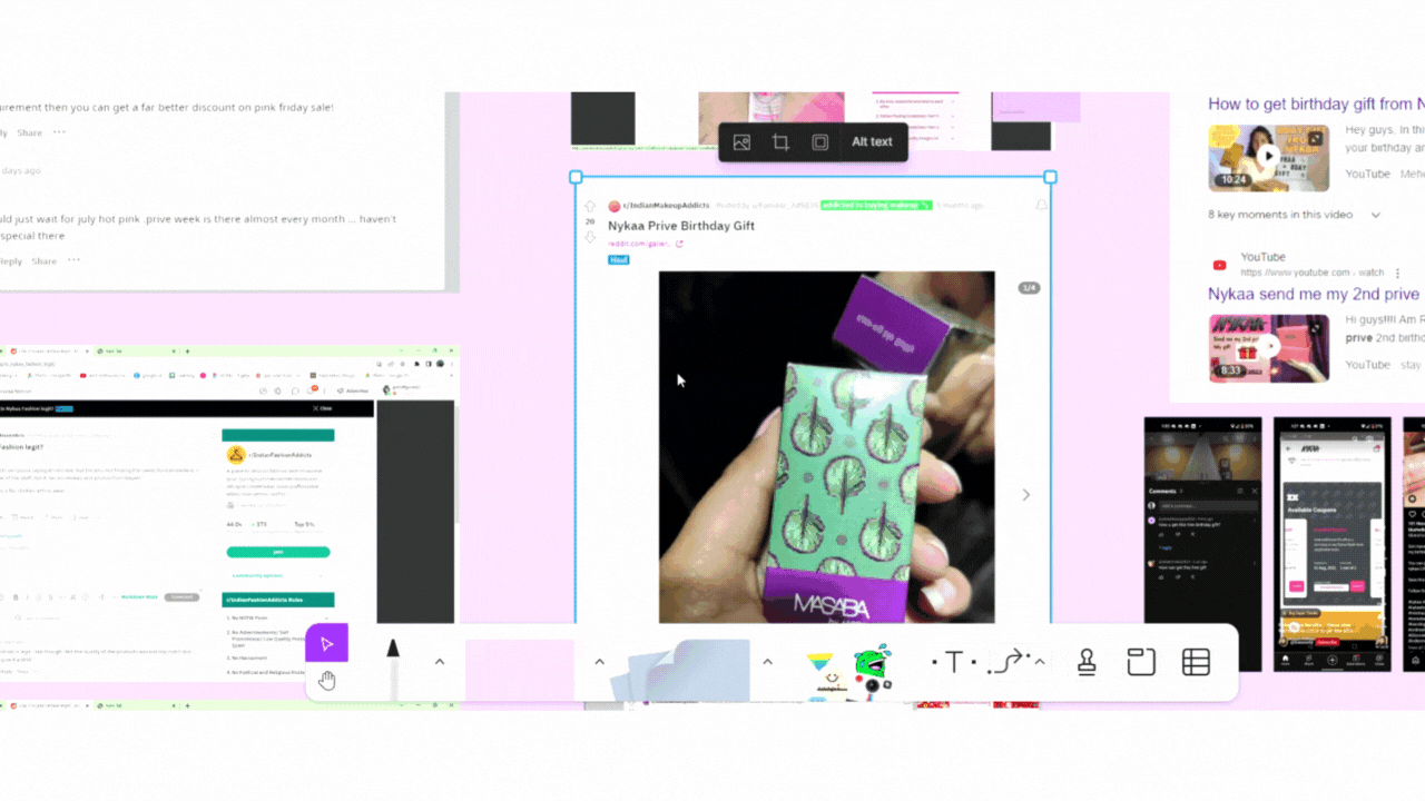
🔎 Reddit Threads: Explored insightful discussions on Reddit where beauty enthusiasts openly shared their thoughts about Nykaa Prive.
📱 Google Play Store Reviews: Analyzed user feedback from the Play Store to uncover usability issues, concerns, and overall satisfaction levels.
🎥 YouTube Review Videos: Watched real-time demonstrations and critical insights from users reviewing Nykaa Prive on YouTube.
📸 Instagram Reels: Checked out bite-sized videos on Instagram showcasing user experiences, opinions, and pain points related to Nykaa Prive.
User pain points
- 🎁Disappointing Birthday Gifts:Offer gift options to choose from for Nykaa birthdays. Create buzz and excitement around the surprise element .
- 🛍️Exclusive Sale Inaccessibility: Ensure easy access to exclusive sales for all Privé members Make Privé members feel special and included in exclusive offers .
- 📲Membership Availment Confusion: Simplify the Privé sign-up process with clear instructions ✍️Provide a smoother and hassle-free experience for joining Privé
- 🎁Lack of Incentivization: Introduce more enticing benefits and rewards for Privé members 💎Keep users engaged and motivated with attractive incentives
- 📞Customer Service and Return Policy Issues: Improve responsiveness and efficiency of customer service .Clarify return policies to enhance customer satisfaction ✅
- 📦Delayed and Inconvenient Deliveries: Enhance delivery services to ensure timely and convenient shipments .Consolidate shipments to minimize inconvenience for customers
IDEATION
I analyzed various loyalty programs online to gather insights and segregated perks accordingly.

- Loyalty Program Analysis: Studied existing loyalty programs online to gain insights and categorize perks effectively.
- Clearing Confusion: Introduced a two-month free trial period to address ambiguity and provide clarity about the Prive feature.
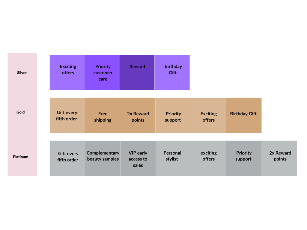
- Silver Tier: Designed basic incentives for the Silver tier, including rewards, birthday gifts, improved customer care, and exciting offers, targeting key pain points.
- Gold Tier: Introduced additional features for the Gold tier, such as goodies on every fifth order and free delivery, encouraging customers to progress to the next tier.
- Platinum Tier: Targeted users with higher spending capacity by offering benefits like stylist sessions and complementary beauty samples.
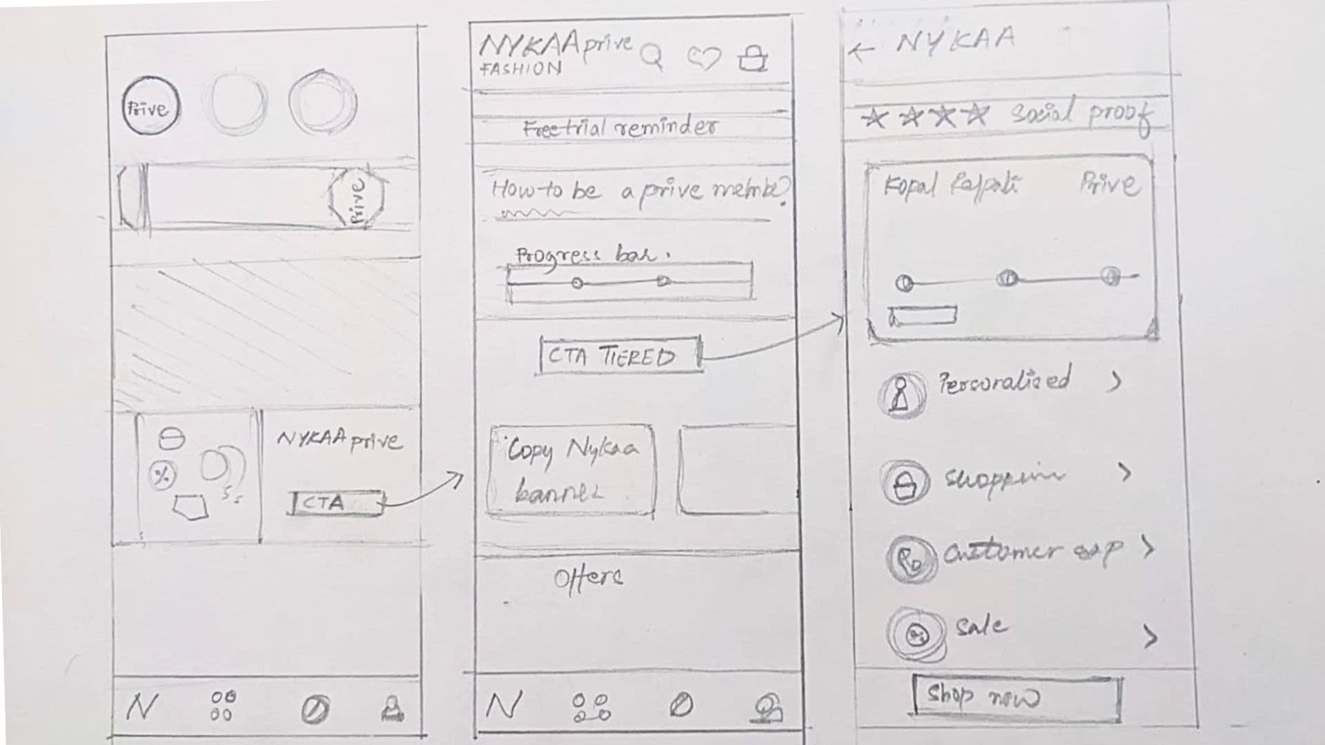
- Visualizing the Feature: Brought the ideas to life through pencil sketches and wireframes, allowing creativity to flow and establishing the initial visual language of the feature.
Decoding the visual language
When it comes to designing an interface for a new feature, studying the app's visual language is like ensuring a seamless experience. Why reinvent the wheel when you can revamp it?
Understanding the visual language had two parts for me.
The Captivating World of Nykaa Fashion: Immersed in the app's visual language, I optimized its layout and information architecture for better user experience.
Exploring Nykaa Beauty's Prive Feature: Studying the Prive feature, I created a unified loyalty program for Nykaa, considering Nykaa Fashion's unique needs.
Establishing the framework
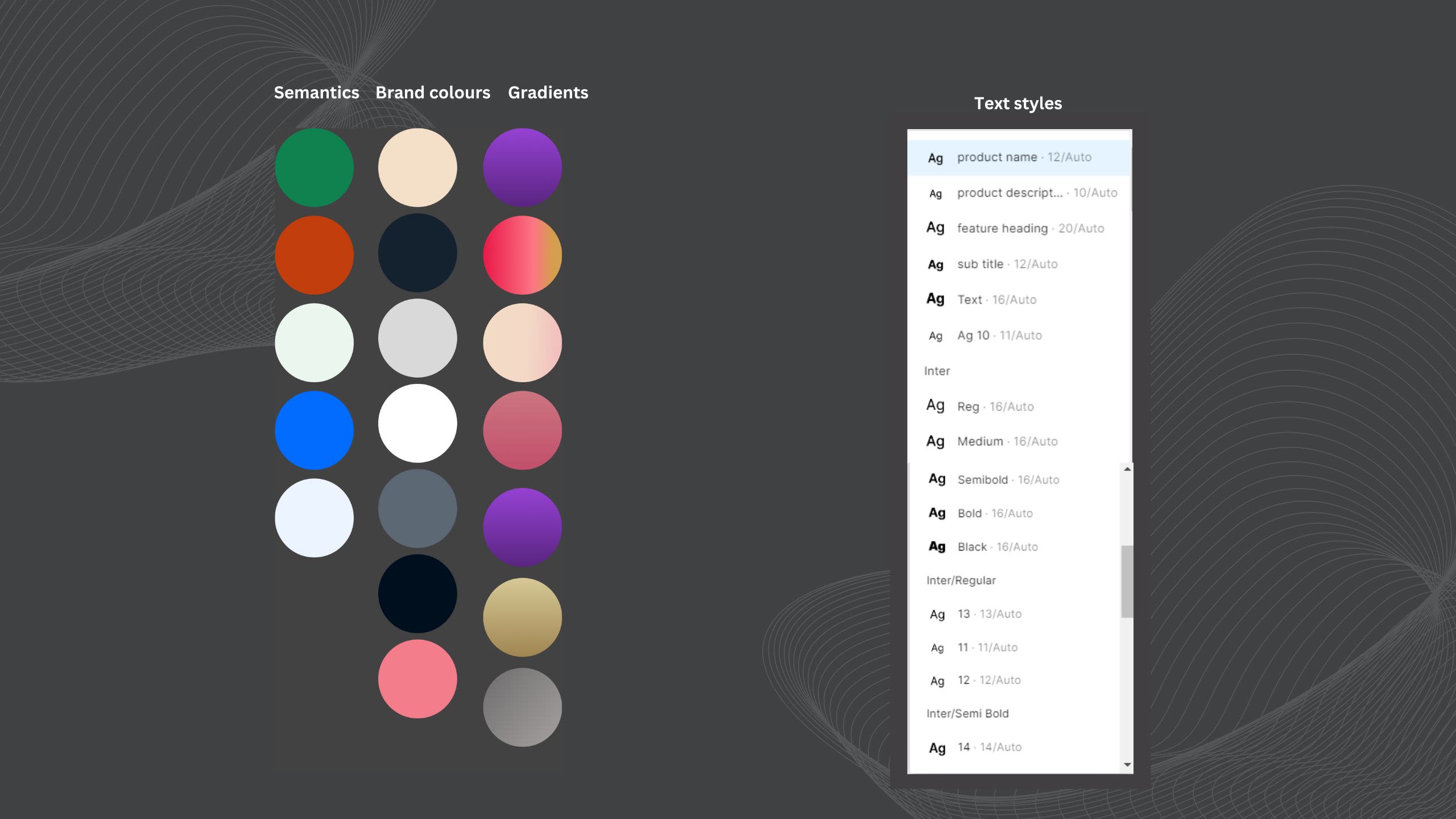
Just as bricks are laid before building a wall, crafting UI components and defining text color styles precede the creation of a cohesive UI design.

From blueprint to beautiful chaos


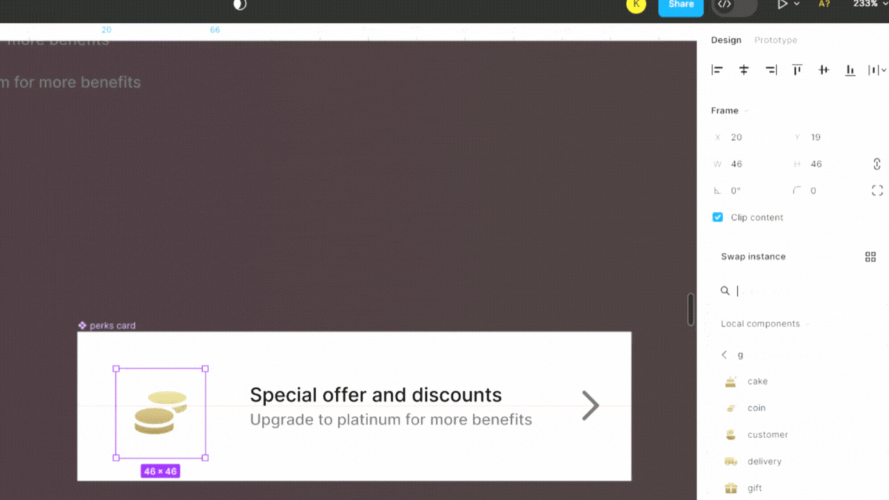
Component Crafting
Created design LEGO pieces, assembling reusable components that maintained a unified design language, while also promoting efficiency and consistency in my design process.
CARD DESIGN SYSTEM
FEEDBACK AND REFINEMENT
After completing my design, it was time to test my ideas with users and identify improvement opportunities through user testing. I opted for video call platforms to gather reviews, allowing me to observe user reactions and gather valuable insights.

During the iteration process, I received invaluable assistance from my talented teammates who offered insightful suggestions for improvement which helped me evolve my design.

What changes did I make ?
After gathering insights from various individuals, you might be curious about the changes I made. Well, on the home page, I ensured to highlight the feature in three distinct ways.
I revamped the feature introduction banner to create a gateway for users. With improved button copy, the message is now clear and concise.
Improvements in the final iteration
Issues I tried to resolve through the revamped approach on the landing page of the feature.I addressed clearer communication of three major things.
- Availing a free two-month trial
- Explaining tiered benefits.
- Simplifying the process of becoming a Prive member.
❇️Reduced cognitive overload : re-wrote the copy , reduced the information , re-aligned the text hierarchy.
❇️Clear call-to-action: Introduced a secondary button that explicitly prompts users to avail the free trial.
❇️Emphasis through visual cues: Placed a coin symbol on the left side of the button, drawing attention and emphasizing its importance.
❇️Created a delightful and engaging animation to evoke a sense of celebration and validation, aligning with the principle of delight.
❇️Clear button copy: Implemented precise and descriptive text on buttons to guide the user journey, following the principle of clarity and the Law of Hick's
❇️Explanatory banners: Created engaging banners that highlight the features of the silver tier of the loyalty program.
❇️Strategic page opening: Designed the page to open directly on the gold card, enticing users to consider upgrading to the gold tier. This approach is based on the assumption that users have already availed the free trial of the silver Prive.
❇️Social proof for trust-building: Incorporated social proof elements to enhance user trust in the new feature, aligning with the principle of credibility and the Law of Social Proof.
❇️Streamlined the design by removing two buttons and replacing them with a single large primary call-to-action (CTA). This decision aimed to eliminate confusion and ensure a clear and concise message.
❇️Introduced navigational signifier.
Pivotal Decisions That Transformed My Journey!
Crafting a multi-tiered loyalty program was a wild ride! Time constraints fueled my strategic thinking for the ultimate solution. First let's look at some pivotal decisions that shaped it.
Or not really interested ? Check my design process↗️
How did I introduce PRIVE ?
In my case study, I took a unique approach by personifying the feature "Prive" as a user-centric persona driven by the desire to befriend users.Leveraging ideation techniques, I delved into the mindset of this persona and applied user-centered design principles to imagine how a person striving to create connections would approach engaging with users. This human-centered approach infused the design process with empathy and allowed for a more intuitive and user-friendly experience.

How did I try to introduce PRIVE ?
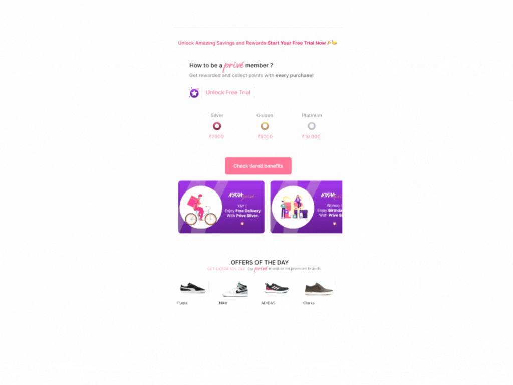
Unveiling PRIVE: The Ultimate Loyalty Adventure
🌟 What's PRIVE? It's your golden ticket to exclusive rewards, explained in a jiffy!
🎯 The banner placement is spot-on, following the Gutenberg diagram and competitor research.
💎 Look out for the reward coin icon—a shiny, can't-miss button for instant VIP access!
🚀 To guide user's journey, I've crafted a visual progress bar. It's like a map to the different program tiers.
⏰ Once you unlock your free trial, i tried to ignite user's curiosity with the Zeigarnik effect.
CRITICAL DECISION 1
How did I try to introduce PRIVE ?
Reciprocatory Bias: Give Before You Ask.
Introducing the free trial as the user's eyes traverse the page, akin to befriending someone new. Setting the tone, we follow the principle of giving something to users before making any requests.
🔥 Iterating on interactions, i fine-tuned the button's copy to create a seamless flow within our app's design system.
🎨 Ensuring harmony in design, the button blends effortlessly with the overall app aesthetics.
CRITICAL DECISION 2
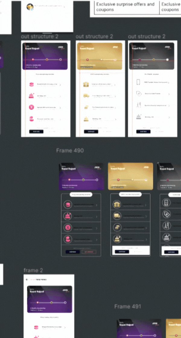
Decoding Tiers🟣🟡⚫ : How did I segregate tiers ?
There were multiple iterations while working on how to represent the tiers but let's just dive into some key decisions in the final design !

How did I choose to depict different tiers ?Decoding the Art of Segregation in My Design Journey
✨ Screen opens directly at Gold membership, enticing users to upgrade for higher rewards.
🔁 Iteration prioritized upgraded version details after users availed 2-month free trial.
👥 Social proof tops the design, validating Nykaa Prive's trustworthiness to build trust amongst the users.
💅 Tier design language inspired by Nykaa Beauty app, offline retail, and ATM cards.
🌈Brand colors assigned to tiers: Silver (purple), Gold (golden), Platinum (charcoal).
💳 Card structure resembles credit card for exclusivity, with progress bar and Gold upgrade nudge.
🎁 Benefits represented by gradient icons, adhering to Prive design system with self-explanatory and prioritized upgraded benefits.
CRITICAL DECISION 3
Drawing a Tangent Between Nykaa Fashion and Nykaa Beauty while making a loyalty programme!
In an attempt to put authenticity into my project, I turned to the design system of Nykaa Prive, showcased on the Nykaa Beauty App. Nevertheless, I made necessary adaptations to align it with the specific requirements of a fashion application and for it to better suit it's users.
Drawing a Tangent Between Nykaa Fashion and Nykaa Beauty while making a loyalty programme!
Embracing the challenge of an existing design system, I embarked on a journey to uncover its treasures and leverage them to create a remarkable user experience. Join me as we explore the elements borrowed from this system.
Within the prevailing design system of Nykaa Beauty, I observed the progress bar to be a prominent and influential element that shapes the user journey.
The progress bar reigns supreme! It's like a trusty sidekick, leading users on an exciting journey through the app.
In my UX case study, I borrowed the icon color and gradient to establish a visual bridge, effortlessly connecting the loyalty programs under the same family. These borrowed design elements serve as a link, ensuring a seamless and cohesive user experience.
FUTURE SCOPE OF THE PROJECT
👉 Sisterhood of Apps: Seamless integration and connectivity between sister apps, creating a unified user experience.
👉Gift-Giving Extravaganza: Leveraging the captivating gift feature for an engaging user experience.
👉 Exclusive Offline Events for Prive Members: Elevating the Prive membership experience with exciting offline events.
👉Highlighting Direct ROI: Showcasing the value and benefits of the loyalty program.
Eureka moments: what did i learn ?
✨ Embracing AI Tools: Integrated AI tools (Chatgpt, Qoqo, Bing chat) for enhanced design thinking.
✨ Convergence within Limitations: Developed the skill to converge solutions within constraints.
✨ Collaboration and Teamwork: Successfully collaborated with a large team on diverse assignments.
✨ Effective Presentations: Improved presentation skills for better communication of design work.
✨ Perseverance and Resilience: Overcame emotional challenges and fear to deliver impactful results.